
Amazon – The new design of the product detail pages
Amazon has recently introduced a new design on product detail pages to be even more attractive for customers. So far, however, the new design has only been tested in the hygiene, household and food categories. While the old layout previously conveyed a lot of information in a relatively small space, the newly designed product pages appear simple and tidy, at first glance offer more white space and are therefore more pleasant for the customer's eye.
 New design:
What changes have been made to the product detail pages?
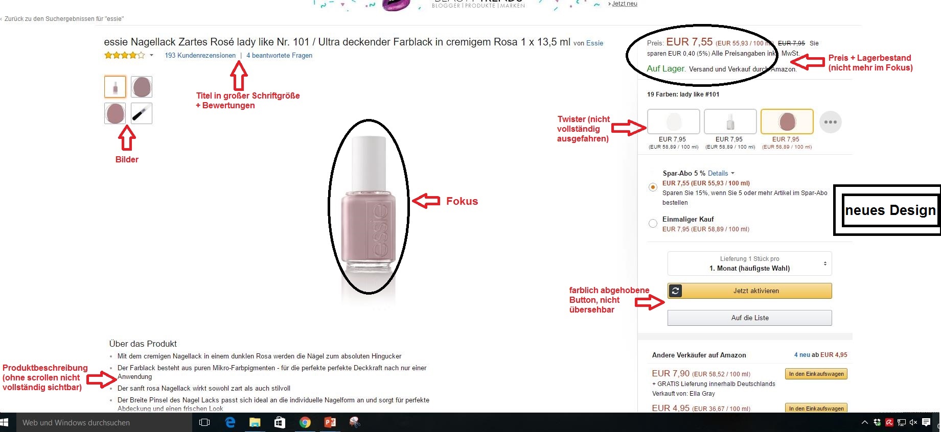
The focus of the product detail page is on a product photo, which markets the product on a monochrome white surface, at first glance and in full size in the best possible way. To the left of the main photo, there are further photos showing the product from different angles, highlighting its special features or providing an atmospheric insight into the use of the product through various presentations. By dragging the mouse over the product images, a magnifying glass effect is created, allowing the consumer to enlarge the images and view them in individual segments. In the new design, the title and customer ratings are displayed larger in the form of stars, which improves legibility and is much more central than before. The product description, on the other hand, is no longer in the foreground, but underneath the images in normal font size, which is usually only completely visible by mouse click. It therefore has a negligible effect on the customer. The right-hand side, which accounts for one-third of the page width, shows the buybox in a new design: first the product price, then the optional Twister and in some cases special purchase or saving options. Below are the buttons "Add to cart" and "Add to list". These buttons are available in an eye-catching colour and a clearly visible format, which is why the customer cannot overlook them. When the customer clicks on a specific product from the search results list, they immediately see these changes. Thanks to the puristic design of the site, however, this change does not place too much strain on the user, but rather motivates them to scroll along the page in order to be able to read the product description in its entirety. In addition, the absence of textures with colour gradients means that the screen contents can be displayed sharply even at high resolution, which is becoming increasingly important in the fast-paced, digital development. The remainder of the page content can be found in the new Amazon product page design in a normal arrangement. Old design:
New design: